Minimalism has been adopted in different industries from architecture to fashion. Somehow, it has also made its way to email marketing trends. Gone are the days when you see bright colors and huge fonts in your inbox from different brands. Now, the simpler the layout, the better.
A minimalistic email design consists of clean fonts and tons of negative space for a more calming effect on the reader – highlighting only the key message. This article will summarize the basics of a minimalist email design and why you should use it for your next email marketing campaign.

Why is a Minimalist Email Design Important?
Based on data from Constant Contact, about 50 percent of customers said that email is their preferred means of business communications, especially compared to SMS and social media. Email marketing has proven its credibility in increasing brand awareness and conversion rates, even for small businesses.
Every day, consumers receive tons of emails from different brands. So the question is, how can a brand stand out from the others? Well, this is where minimalist email designs play a vital role. Since most consumers are busy and on-the-go, they prefer straight to the point emails – typically a quick read with a clear message. The idea of “less is more” has never been this important.
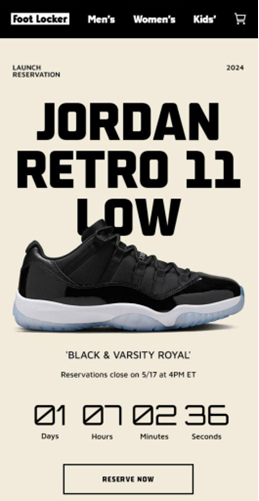
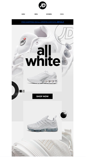
In fact, well-known companies already practice minimalism in their email marketing which seem to work and contribute to their success. One of which is Foot Locker – a trusted one-stop-shop for different brands of shoes from Nike to Adidas. This is one of their latest marketing emails for the latest drop of Jordan sneakers. It’s simple, yet effective.
How to Create a Minimalist Email Design?
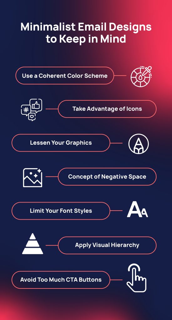
If you’re confused as to how you can achieve a minimalistic design for your email marketing, then here are some tips that you can keep in mind for your next campaign.
Use a Coherent Color Scheme
Monochromatic color schemes are the easiest approach for a cohesive layout. You can use different shades of the same color and the email already looks put together with not a lot of effort. You can also use different colors, but make sure to use 2 to 3 at most.
Of course, it’s better to stick to your branding and take advantage of your businesses’ main colors. But, when in doubt, you can always pair it with neutral colors like black or white.
Take Advantage of Icons
Sometimes, you can replace some words with icons. The less text you use, the better. This can save you space and at the same time, it’s more visually pleasing to your readers. Some icons can already do the talking for your email, but just be wise with which ones you end up choosing.

Lessen Your Graphics
Too much graphics in an email is definitely not a minimalist design. You should only focus on using images that are essential and support your brand’s message.
Concept of Negative Space
The more white space there is in an email, the easier it is to read. The negative space or blank space can balance out the layout of your email with the text and images present. At the same time, the presence of more white space can help you highlight what the readers should actually be paying attention to. The negative space also works as a visual relief and makes your email seem less cluttered.
Limit your font styles
Besides using less text, make sure to limit your font styles. You don’t need different fonts to convey a message to your readers. Just ensure that the text is easy to read and cohesive with each other.
Apply Visual Hierarchy
The principle behind visual hierarchy is to make sure that the essential information is the easiest to see for the readers. The elements in your email can mislead readers on the actual important information you want them to know. So, make sure that the necessary details are placed on top of your email.
Avoid Too Much CTA buttons
Adding too much call to action buttons can confuse your potential customers and they might end up not clicking at all. It’s better to limit one CTA button per marketing email so that readers know the next step to take after reading your message. There’s also a higher chance for them to click the button when you single out the next action for them to do.
To wrap it up, simplicity is not always a bad thing. Sometimes, it works better in your favor when you keep things minimal – especially in email marketing. The customer behavior is constantly changing and it can be intimidating to keep up to the latest trends.
Applying minimalism to your email marketing gives you the advantage of having a clean layout that will not go out of style. More than that, keeping a minimalist email design ensures that your message is easier to comprehend and can reach your target audience faster. Minimalism is not only a trend, but a progressive way of thinking that you don’t need much to see what’s actually important.
References:
https://beefree.io/blog/7-minimalist-email-design-tricks-for-email-marketing-that-sparks-joy
https://www.engagebay.com/blog/email-design-best-practices
https://selzy.com/en/blog/minimalist-email-design
Ready to start?